Healthcare’s Million Dollar Blocks
Since I first heard about them, I have been fascinated, and dismayed, by the concept of “million dollar blocks.” For those of you unfamiliar with the term, it doesn’t refer to, say, Beverly Hills, Chicago’s Gold Coast, or Manhattan’s Hudson Yards — areas where the wealthy congregate. No, it refers to city blocks for which society spends over a million dollars annually to incarcerate residents of that block.
I, of course, have to think about the healthcare parallels.
The concept dates back many years, credited to Eric Cadora, now at Justice Mapping, and Laura Kurgan, a professor of architecture at Columbia University, where she is the Director of the Center for Spatial Research (CSR). The power of the concept is to use data visualization to illustrate the problem.
Here, for example, is CSR’s map of Brooklyn for prison spending:

CSR describes the findings as follows:
The maps suggest that the criminal justice system has become the predominant government institution in these communities and that public investment in this system has resulted in significant costs to other elements of our civic infrastructure — education, housing, health, and family. Prisons and jails form the distant exostructure of many American cities today.
Think about that: “criminal justice is the predominant government institution in these communities.” Something is wrong with that picture — not theirs, but, rather, the picture of our society that it presents.
Mr. Cadora told NPR in 2012:
No one had ever actually sat down and gotten the home street address of everyone going into prison and jail, as well as all the background information about their age and their employment status, etc. And when you have all that data, it tells you a lot about what’s going on on the block.
In all honesty, what we mapped was not a big surprise to people. But when you actually gather the real data … on maps, [it becomes] immediately understandable to people who didn’t see it — like legislators, city council people, researchers.
No, not a big surprise, not to most people. We know we spend lots of money on criminal justice; we just don’t always realize how we spend it. We’ve long had the dubious distinction of locking up more people — in total and per capita — than any other country.
But if, as they say, a picture is worth a thousand words, then perhaps data visualization is worth a million dollars. Even hardened criminal justice advocates have to blanche at how spending is so often concentrated in certain blocks, and should wonder if perhaps there are better ways to use that money for them.
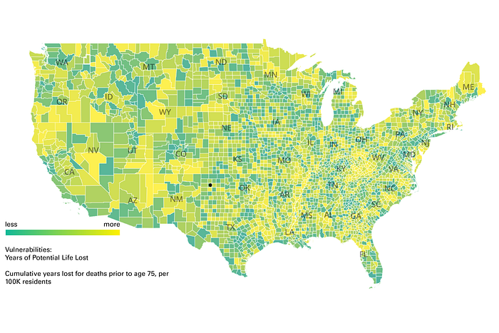
CSR has a variety of projects in addition to their criminal justice work, including some focused on healthcare. Earlier this year, for example, they created an interactive vaccine allocation map to help guide decisions about allocating then-scarce COVID-19 vaccines, and late last year their New Politics of Care project used an interactive map to highlight existing areas of health care needs. They proposed a New Deal for Public Health, with a million new community health workers deployed around the country based on the identified needs.

Somehow the Community Health Corps didn’t make it into the Biden infrastructure proposal. Perhaps no one in the Administration has seen the map.
Data visualization is nothing new for healthcare. The CDC has an Interactive Atlas of Heart Disease and Stroke, the Dartmouth Atlas has been highlighting healthcare variations for close to thirty years, and, more recently, the Johns Hopkins Coronarvirus Resource Center has been tracking what’s been happening in the pandemic.
CMS has a dashboard that purports to show “standardized per capita costs” down to a county level, based on Medicare fee-for-service claims, but that’s only for Medicare spending for only a portion of the Medicare population. That’s still a long way off from total spending for the whole population, at a city block or even zip code level.
Still, if anyone is tracking where healthcare’s “million dollar blocks” are, I’d like to hear about it.
We know — or think we know — that there are underserved communities where too many people end up in the emergency room. We know that there are communities in which maternal and infant mortality/morbidity are much worse. We know that there are food deserts that lead to poor nutrition and subsequent poor health outcomes. We know that environmental factors like lead poisoning, air pollution, or, of course, gun violence, lead to differences in health and in healthcare spending.
But do we know where these are concentrated, or do we know how much we’re spending on the results of them? No.
I want to know in which communities the hospitals are the predominant healthcare institution. I want to know in which communities diabetes is rampant. I want to know what communities are falling behind on preventive screenings and vaccinations. I want to know which communities have suspiciously low healthcare spending, and whether that is a function of better health or lack of healthcare resources.
I want to see the interactive data visualizations for these types of issues, and I want smart people acting on them.
If the pandemic has highlighted anything, it’s that our public health system is woefully inadequate. It’s a patchwork of overworked county and state public health departments, with a too-tenuous connection to the CDC. It doesn’t have the right resources and doesn’t have the right data, collected and acted upon at the right time.

Healthcare generates scads of data, but not the right data, timely, aggregated across all payors for all kinds of services, and we certainly don’t have anyone in a position to really use it to manage.
The “million dollar block” concept highlights the fact that we’re good at spending money, but we’re not very good about how we end up spending it. It emphasizes the rationale of “defund police” movement, and should be applied to healthcare as well (as I’ve discussed before).
I guess we need to see the pictures first.
